
CLIENT WORK
ABC Smog & Repair
Mission
ABC Smog specializes in Star Certified smog checks & auto repairs in Fremont, California, owned and operated by husband and wife duo, Lucky & Annabel Lally, and their top dog Chewy. Their mission is to deliver fast, friendly, and quality service at a great price.
Design Goal // Branding + web design
ABC Smog was in need of brand identity and marketing consistency. My clients reached out to me to update their image. I created a new bold typographic logo inspired by car anatomy, simplified their website and slogan, and changed the color-palette to red and black for powerful visual appeal. All photography was taken by me and was incorporated in the web design to capture the consumer’s attention and to reflect the owners’ outgoing personalities and core values, quality workmanship.
abcsmog.com

ABC Smog Logo on Stock Image
Promo

ABC Smog
Business Card (Front View)

ABC Smog
Business Card (Back View)

ABC Smog Website
Homepage
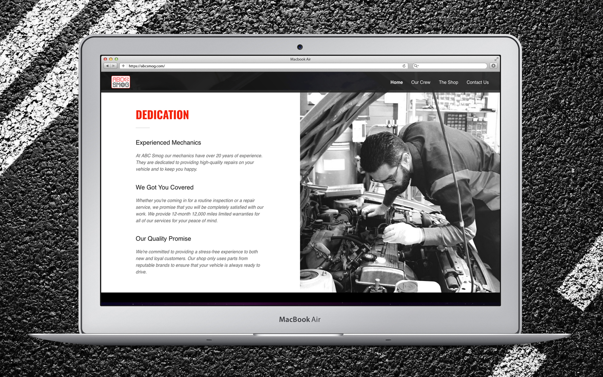
ABC Smog Website
Homepage Dedication

ABC Smog Website
”Our Crew” Page

ABC Smog Website
”The Shop” Slideshow Page

ABC Smog Photography of Embroidered Logo on Jacket
PALMER BOOKKEEPING & Administrative services
Mission
Palmer Bookkeeping & Administrative Services is headquartered in San Diego, California and founded in 2008 by CEO, Tammy Palmer. Their staff has over 25 years of bookkeeping experience, they are Certified QuickBooks ProAdvisors and members of AIPB (American Institute of Professional Bookkeepers). The firm was created to provide professional guidance in all areas of Bookkeeping. Their mission is to take the stress from customers so that they can focus on the additional important tasks within their business.
Design Goal // branding + identity stationery system
A client from Palmer Bookkeeping & Administrative Services reached out to me to rejuvenate their branding corporate logo and stationery system, keeping their burgundy color scheme. I created a clean, minimal die-cut style logotype, creatively fusing together a book graphic & letter P. I also used a welcoming and sophisticated serif typeface, Mrs. Eaves. For the stationery set, I incorporated numerical stock photography and created a typographic design using numbers for interest and to tie-in with the bookkeeping theme.

Stationery System + Logo Design
Norman’s 100th Birthday Invitation
Mission
One of my favorite cards I was given the opportunity to design for was a 100th birthday celebration invitation for Norman Thrower. His daughter planned a casual get together at his house with close family and friends in Pacific Palisades, California in 2019.
Design Goal // digital graphics + print media
Elegance and whimsy was the design goal for the invitation, using digital illustrative elements and 1920’s style typography. I went with a high-quality cardstock 5x7” double-sided card. The front features cute penguins wearing tuxedos and holding platters of champagne, appetizers, and cake. I incorporated Norman’s favorite color green and added touches of gold for contrast and to enhance the grandeur of this special occasion.


Card (Front View)

Card (Back View)
PAISAN MUSIC
Mission
Paisan is a talented independent hip-hop artist based in the East Bay Area of Fremont, California, he reached out to me to help market his music and establish solid branding for social media and various music platforms such as Datpiff, Instagram & Youtube.
Design Goal // mixed media branding + Album cover art
I created a minimal “P” logotype in striking red and white inspired by microphone sound waves and energy. I also designed the stormy album cover for his first mixtape, “El Niño.” Followed by various photographic & illustrative covers for his top singles including: “Y’all Don’t Hear Me,” “Makin’ Waves,” and “Villain.” I enjoyed the process of bringing his unique vibe and vision to life.
Instagram: the_real_paisan
Youtube: Paisan music page

Paisan Artist
Promo + Logo

Paisan - El Niño
Album Cover + Disc Design

Music Platform Perspective

Singles Cover Art
eon foods international
Mission
Eon Foods International LLC is a wholesale company based in California, which promotes a healthy lifestyle, fair trade practices, environmental sustainability, and humane farming. The name “Eon” means everlasting. Eon Food’s philosophy is protecting the beautiful environment provided to us by Mother Nature. By practicing sustainable, pesticides free agriculture; maintaining pure and uncontaminated water; and treating farm animals with love and care, so we can live in harmony with nature for generations to come. Eon Foods strives to bring the best natural products from all over the world to your home and make it a place where everlasting relationships, health and happiness thrive.
Design Goal // Branding + package design + photography
A client from Eon Foods reached out to me to update their image and to create; poster ads, brochures, food photography, and packaging to promote their featured products: GreeNoodle® and Organic Mulberry Tea®. The design is fresh, minimal and earthy, and 100% biodegradable, staying true to the sustainable core values of the brand.
greenoodle.com
organicmulberrytea.com

Stock Image

GreeNoodle® Original Logo

GreeNoodle® Logo
Redesign Concept

GreeNoodle® Instant Noodle Soup
Package Redesign Concept

Think Green, Eat Greenoodle®
Poster Promo

GreeNoodle® Salad
Food Photography at Osha Restaurant in San Francisco, CA

Organic Mulberry Tea®
Poster Ad

Organic Mulberry Tea®
Tri-Fold Brochure + Infographics

Organic Mulberry Tea®
Package Design Concept
ROC Race Tees
Mission
ROC Race (Ridiculous Obstacle Challenge) is a 5K outrageous obstacle course race inspired by the original TV game show established in 2011. ROC Race is an untimed event open to everyone from couch potatoes to track stars. Their mission is to create an experience you will never forget, while raising money for good causes.
Design Goal // DIGITAL T-SHIRT GRAPHICS
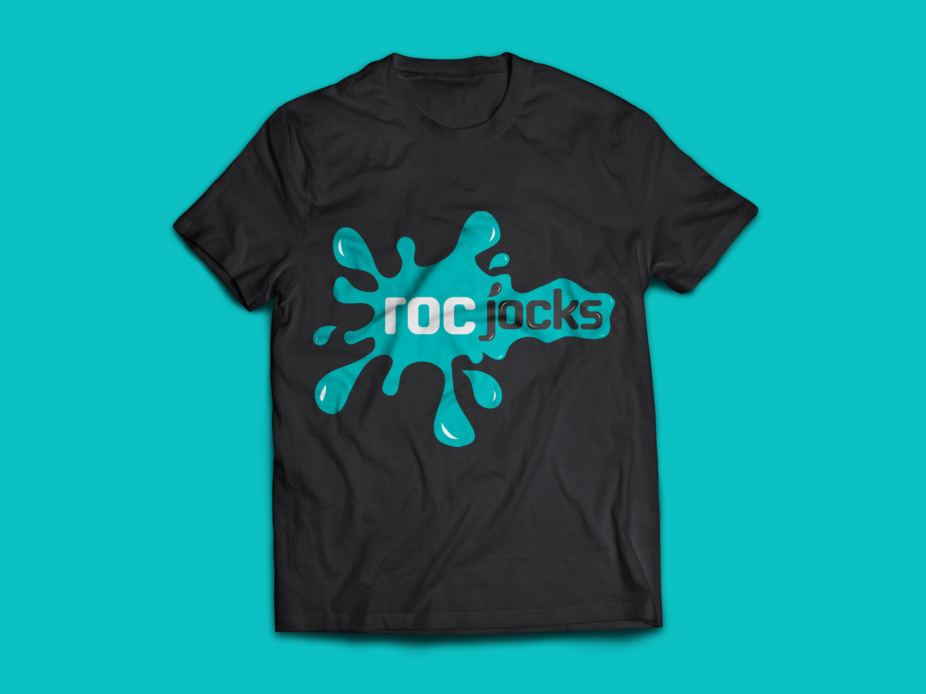
A client reached out to me to design their custom “Roc Jock” t-shirt logo for their ROC Race team in San Diego, California in 2013. I designed a fun and energetic splash graphic to reflect the extremely wet epic experiences of this race along with a bold sans serif typeface that packs a punch.
rocrace.com

Stock Image from ROC Race

SDLH Roaring 20’s Fundraising Gala
Mission
San Diego Las Hermanas,’ founded in 1960, is a charitable organization of women joined together to assist their community through volunteer service and financial aid given from the heart with faith, hope, and love. The Mission of San Diego Las Hermanas’ is to reach out to a wide range of charitable organizations that benefits women and children and touch the hearts of those that have the ability to contribute, either monetarily or through volunteerism.
Design Goal // Digital graphics + layout + print media
A client from San Diego Las Hermanas’ charitable organization reached out to me to design an event invitation, save the date card, RSVP card, sponsorship form, and event program for a Roaring 20’s inspired fundraising gala in Spring 2019. The gala benefits marvelous philanthropies of women and children in need. I created a 1920’s silent film era theme throughout the set using ornate elements, vintage photography, 1920’s style typography, and dramatic gold and black colors to set the scene.
sdlashermanas.org
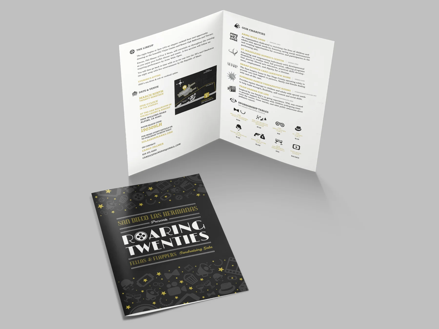
Roaring Twenties
Bi-Fold Invitation

Roaring Twenties
Save The Date Card (Front View)

Roaring Twenties
Save the Date Double-Sided Cards

Roaring Twenties
RSVP Double-Sided Cards

Roaring Twenties
Sponsorship Form

Lights, Camera, Auction!
Event Program Front Cover Design

Lights, Camera, Auction!
Event Program Cover Design Spread